Role: Designer/ Researcher
Tools: Figma and Adobe Illustrator
Background
InsideART is a program that I have been a part of since 2011 and I currently continue to contribute and attend. InsideArt is valuable to secondary teachers and validates the importance of the visual arts in education. because this is a program that I am deeply passionate about, I thought it would be a good candidate for my responsive web design project. However, when visiting the InsideART site, I found there were many issues that needed to be addressed before responsive design could begin. I knew that the extra time would be needed for testing and to gather the appropriate amount of research to be successful
The Process
I have used the Double Diamond process to help me organize the steps needed to complete this project. Because this was no longer just a project on responsive design, added steps and research were considered in my timeline
.png)
Discover
Before any rebranding and layout design, a Heuristic evaluation was given, to show data that the issues with InsideArt were not just my personal opinion, even though I met the target demographic.


" the site is very text heavy. Honestly, I would skip over all of this information or just not use this site. "
"I'm having difficulty finding the lesson plans or curriculum samples.... I finally found it, but it looks like the only way to view it is to download everything. I would have to go to my computer at home to do this."
"... I have no idea if the exhibition has anything to do with my content area. I don't think I would have time to click each exhibit and watch videos if I'm not even sure I can use it to teach a future lesson.
I needed to get an idea of what others were doing in this field. Through a competitor analysis, I could gather the overall mood and organization of other galleries and museums.
When researching "competitors", I was surprised to find some of the most well-known museums in the country and universities with galleries did not have a program for their educators like InsideART offers. Many schools and museums understandably focused on the art but there were little resources such as lesson plans and suggestions on how to use a visual art exhibition in other content areas or in curricular collaboration. In some cases, even images were not as accessible. I knew that InsideART has something special and I wanted that to reflect in their online presence.
Define
Based on the previous information I developed the following persona. Pablo is a teacher with more than 5 years experience in the same school. As a teacher with a number of years under his belt, he can now move from classroom management and general survival to building building his craft. This is the time in a teachers career where Pablo has a bit more time to think about how to really make his lessons rich and impactful. Pablo is very interested in the idea of adding visual arts to his lessons but is not confident that he can speak about how the art content and techniques can enhance social studies. This is where InsideART can help!

An Empathy Map was created to focus on the needs of the user. this allowed me to pinpoint the most important areas of concern and find a solution

Area of concern
My Solutions

Utilize more visuals and negative space
Difficult to find what I need
Categorize and glabel for better understanding.
I don't know what resources to download
Better way to download ancillary resources
Would like to see more visuals and videos
Add gallery and video testimonials.
Would like an easier way to find the connection to my content area
Create tags, labels and theme for each exhibition
Ideate
The following is a diagram of the new, condensed categories, In the original site, InsideART was given a single page within the Contemporary Art Museum site. However, there was so much information and resources that what teachers needed were lost. The new Home page greets the user with a quick explanation of InsideART, vieeo testimonials and a space to see sponsors icons and links. This will give the users just enough information to see if they would like to continue. The most important page for teachers will be unter the curriculum tab. This will allow for easier and quicker access to the good stuff teachers are really searching for!

When creating the wireframes for the overall layout, I wanted the design elements to reflect the idea of "traditional meets contemporary". The layout stay readable through traditional triangles and grids. The lighter background mimics the contours of the Contemporary Art Museum architecture, with sharp, pointed angles.

The same inspiration can be seen in the new icon design. A traditional serif font symbolizes the core academic education and the script font shows the freedom of line representing the visual arts.

Prototype

You can continue to see the pattern of traditional meets contemporary through the color palette of the new design. I went with a neutral, warm, background so users could appreciate the art work without distraction.
Image the the original logo

The first prototype I created was specifically for the new brand and layout design. Throughout this stage. I was still finding areas in the original site that I had missed, such as a donation link. So I created a CTA button for donations that can easily be seen from the navigation bar as well as the footer. The new InsideART logo can now be see in the homepage and the navigation bar, where in the original site, the logo can only be seen when certain documents are downloaded.
 Try the Prototype!
 As much as I could see significant improvement in the overall design, the area that concerned me was the areas that would use the most, the resources. I failed to think of an alternative and was hoping to get more insight with the usability test results. Below are the before and after images of this section.
Original site of resources.

First prototype

As expected, much of the issues in the usability testing were found in the RESOURCES PAGE. Below is the summary of the tip 4 concerns.
1. Quicker way to find a connection between the exhibitions and their subject mater
2. Wants to know more about the resources before they downloaded
3. Would like print option
4. Continue to keep the choice of individual resources but more readable.
In this round of iterations, I believe I found a solution to this problem area. All participants like the idea of downloading all of the resources in one .zip file but were not willing to let go of the choice to download individual documents and powerpoints. It was expressed that based on the label, they had no idea what they were downloading ,making them hesitant to do so. There was also mention about the safety of downloading content. During the second round of testing, PRINTING was mentioned for the first time. Because of this I sent follow up questions about printing and all agreed it was a feature they needed but just didn't think to mention. This was an easy and quick featureI could add without much change to the layout.
First Prototype
Final Iteration

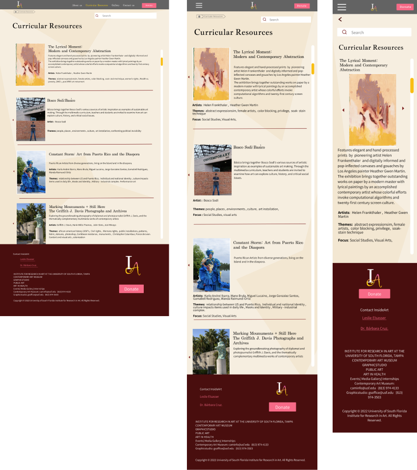
Now that the rebranding and new layout were established, I could concentrate on the responsive design! The original site did not design for a variety of devices. This was incredibly frustrating to users that only had a few minutes to look up ideas, images or references. Text was almost impossible to read without zooming in and out constantly. This hassle was enough for users to leave the site completely.
Below are images from the current site.

First draft of responsive design which includes the new layout, rebrand and logo design.

Landing page - responsive design

The landing page now holds just enough information for teachers that are unfamiliar with InsideART to understand the purpose of the site.. I designed for a welcoming but professional mood that also can quickly explain to teachers what InsideART can provide. I arranged the mobile design so users can see information and images to what would be most important to their needs.
The gallery is my addition that does not exist in the original site. I kept the grid smaller with more images than in the Curriculum Resource Page. There are strictly photos (for now) and scrolling through larger images would be time consuming for users especially in the mobile format. The intention is for users to glance at the thumbnails and click an image to see a larger version or they may click on one image and have the option to swipe to see the next artwork. If this site has the chance to evolve, I envision each image would have the name of the teacher and teacher's contact information and allow for possible connection and may be allow for dialop and possible collaboration

What's in the future for InsideART?
The new additions, rebrading, and new logo design were well received by the administration of InsideART. They stated the highlights for were the addition of the Gallery, Video Testimonials, and general organization of topics.
Unfortunately, because they are bound by the restrictions of the university CAM, they could not implement the changes at this time but were entertaining the idea of creating a link from the USF site to the more teacher-friendly version. I would like to see more teacher testimonials and a hearty amount of student work. I would also like to predict that there should be an added element of a student highlight page or develop a more extensive keyword bank so users can connect their content through a number of exhitbition themes.
Copyright Lenny Cabanero-Harvey. Made in Webflow.


